
Design Systems / FinOps
Filter Consistency
Four different filter implementations across the same product. Different locations, different behaviors, different visual treatments — all solving the same problem, none of them solving it well. This is the story of replacing four patterns with one.
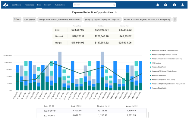
Results
The same action, behaving differently on every page.
Observation across customer interviews and support tickets — 2023
Challenges
The hardest part of this project wasn't the design. It was getting four engineering teams — each with a working implementation and a legitimate reason to keep it — to agree to replace their approach with someone else's.
Organizational
- —Four engineering teams, each owning a different page — each with a working implementation and legitimate reasons for keeping it
- —No shared component infrastructure — every filter pattern was built in isolation with its own logic
- —Getting alignment required presenting the data before showing any designs
Technical
- —No existing component library to build on — the shared component had to be designed and built from scratch
- —Each page had different filter requirements — the component had to be flexible enough to handle every context without bespoke code
- —Rollout had to happen across four pages simultaneously to avoid a period of partial inconsistency
The Problem
Before designing anything, I audited every filter implementation in the product. Four pages. Four distinct patterns. Zero shared behavior.
01
Cost Reports
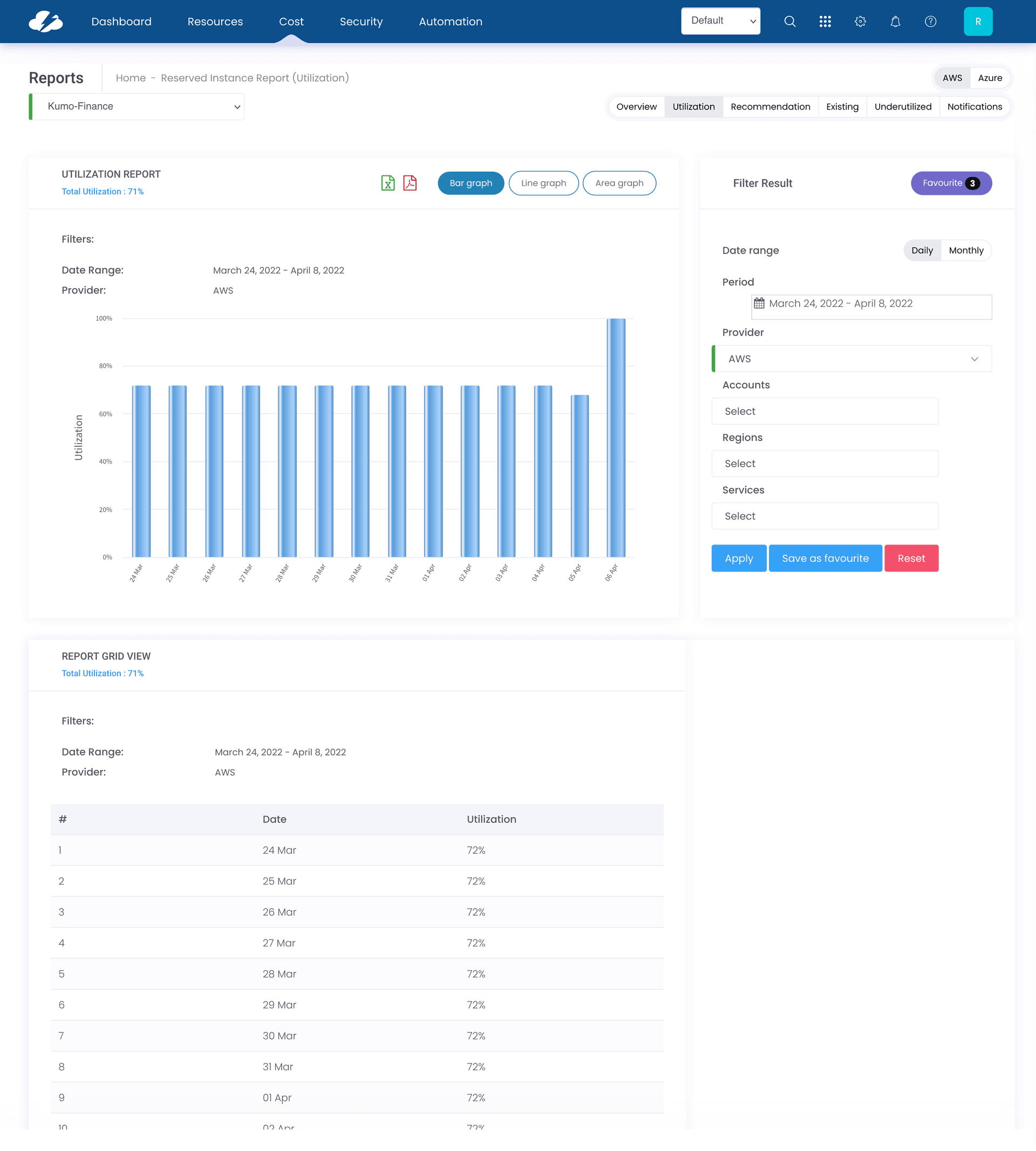
- —Filters stacked vertically, consuming significant page height with no way to collapse them
- —Applied filters not visible in a summarized state
02
Dashboard
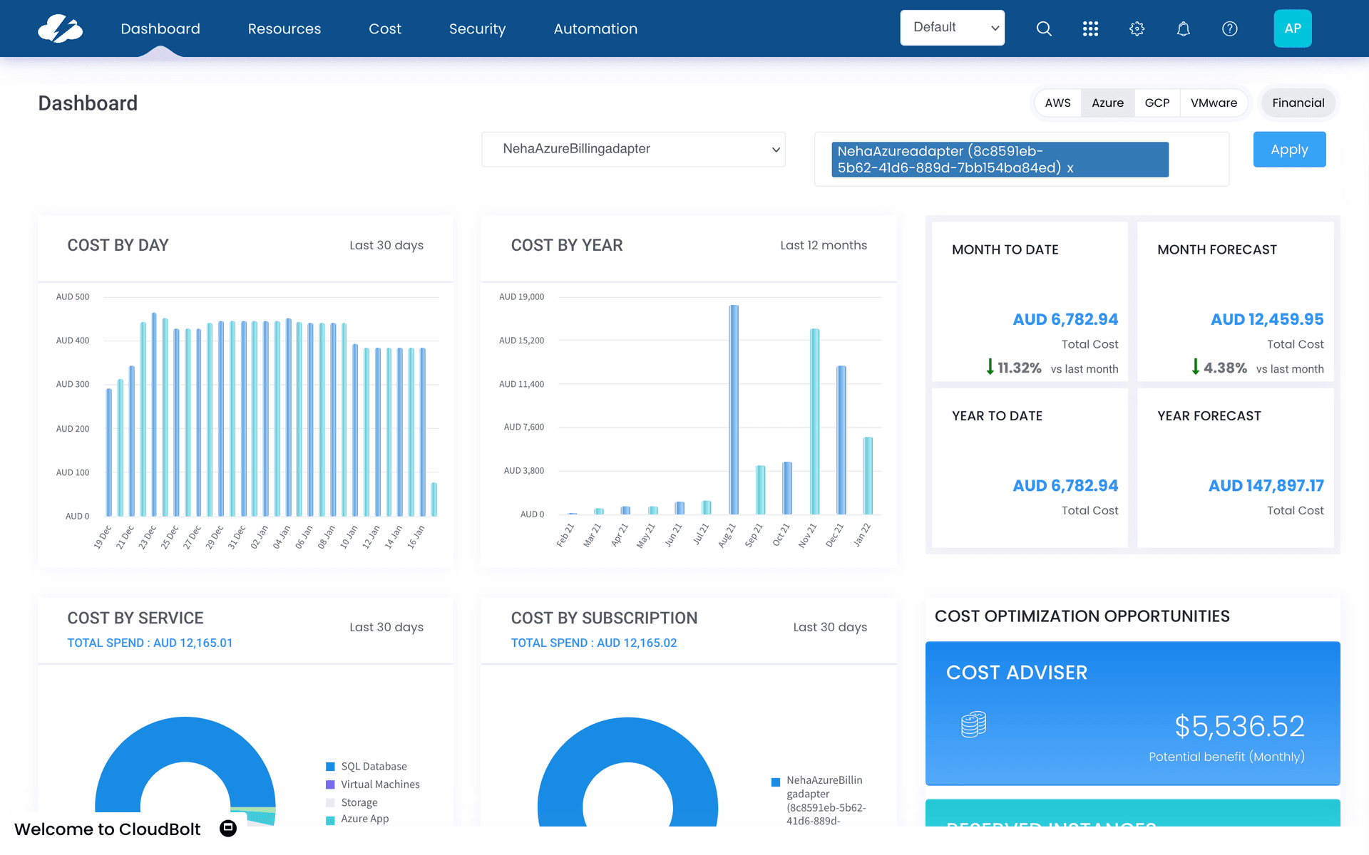
- —Filter placement different from Cost Reports — top of page vs. side panel
- —No visual indication of which filters were active
03
Service Adviser
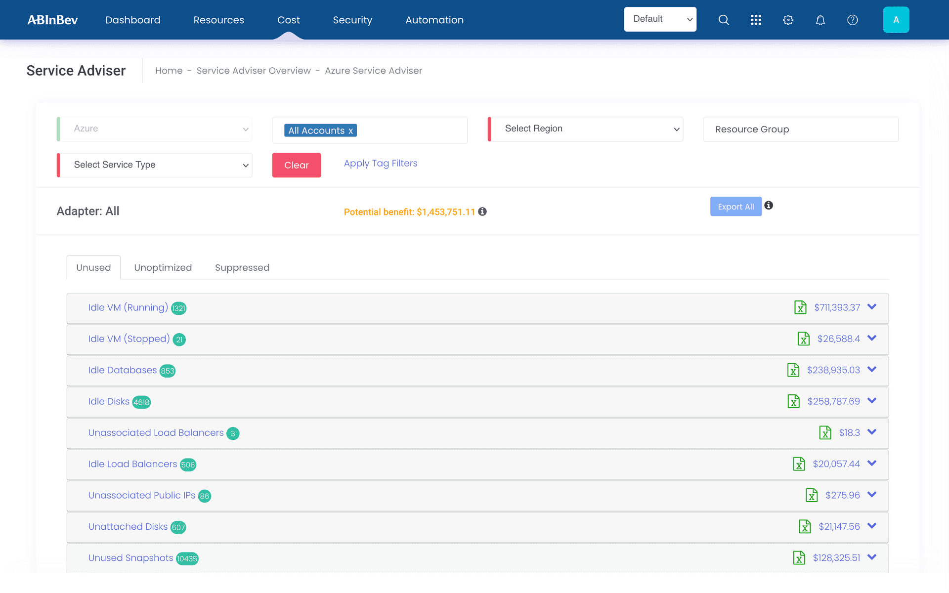
- —Third distinct filter layout, matching neither Cost Reports nor Dashboard
- —Filter state reset on navigation, forcing users to re-apply on return
04
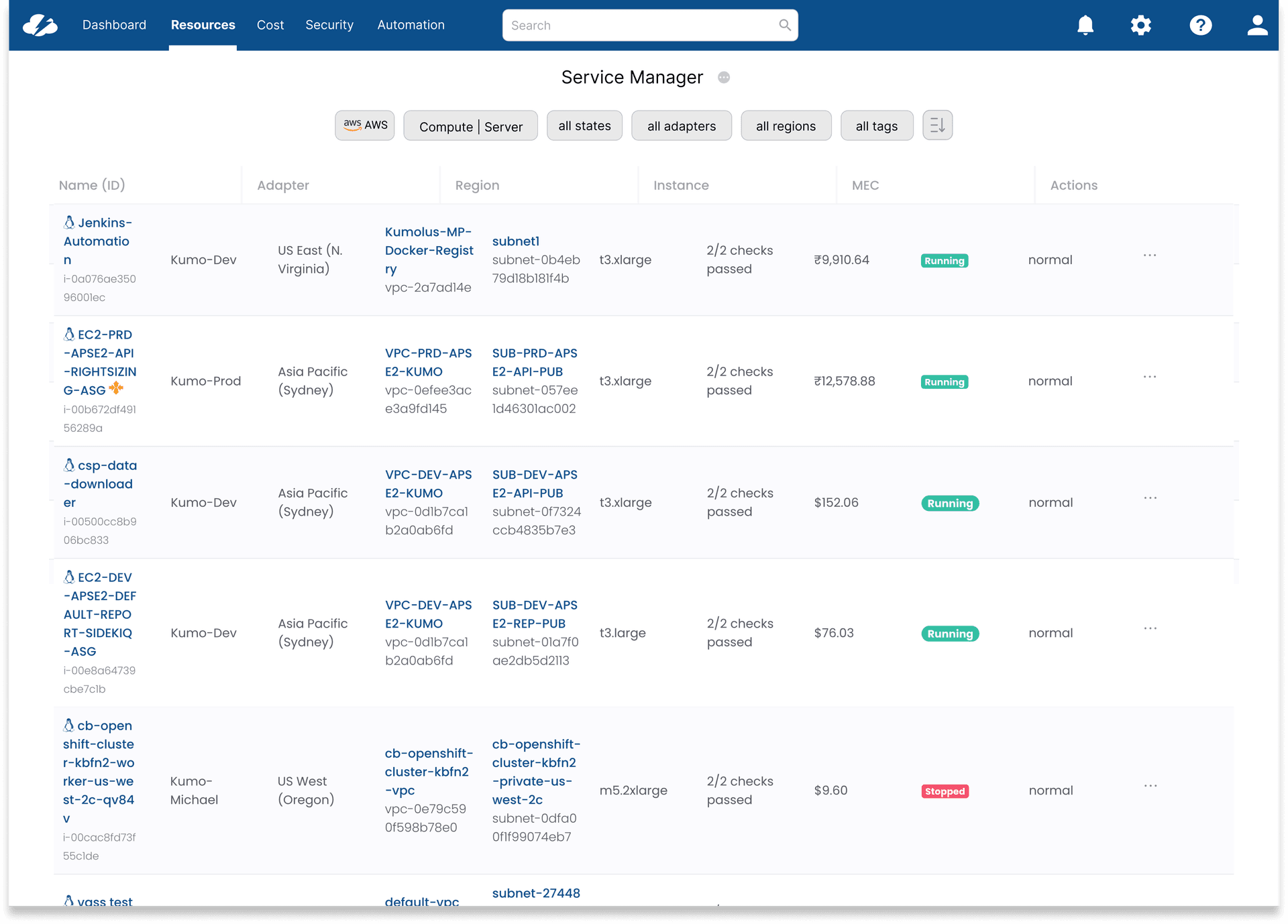
Service Manager
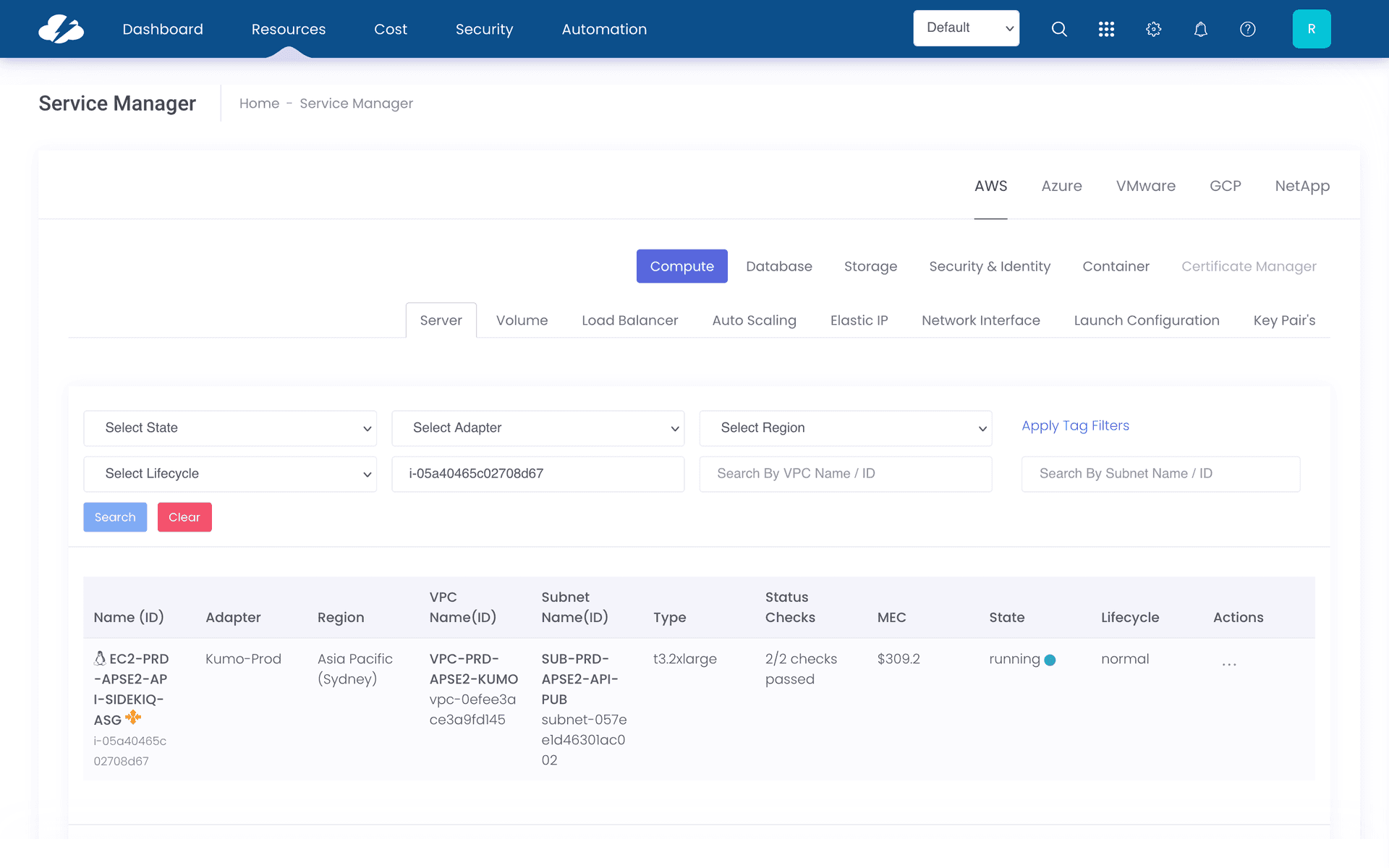
- —Most visually inconsistent of the four — different button styling, different positioning
- —Admin and user filter options mixed without clear hierarchy
Design Direction
Before sketching, I looked at how well-designed filter systems handled the same tradeoffs — particularly around progressive disclosure, applied state visibility, and space efficiency.
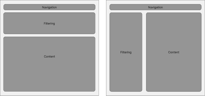
Top placement gives content more horizontal room but pushes it below the fold. Side placement keeps filters always visible but compresses the content area. Neither worked as-is — the answer was a collapsible top bar that collapses out of the way once filters are set.
Collapsible by default
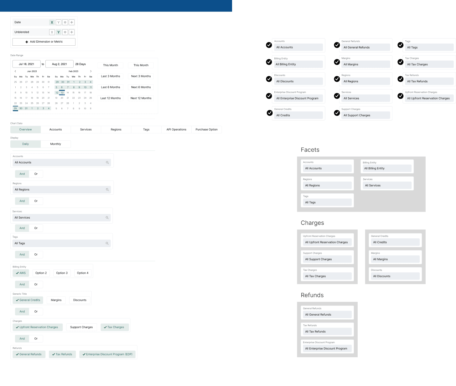
Filters should take up space only when the user needs them. Collapsed state shows applied filters as chips — enough context without occupying the viewport.
Applied state always visible
Even when filters are collapsed, the user can see at a glance what's active. No more "why are my results filtered?" confusion.
One component, every context
A single reusable component with configurable sections — not four bespoke implementations. Engineering builds it once; design controls it through props.
Consistent placement
Same position on every page. Users develop a mental model once and it works everywhere — not just on the page where they learned it.
Process
The design started on paper — working out the collapsible behavior and the applied-state chip pattern before introducing any visual detail.
01 — Sketching
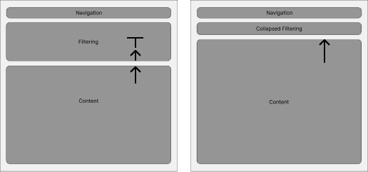
Two questions drove the sketches: how does collapsed state communicate what's applied, and how does expanded state avoid overwhelming users? The answer to both was grouping — sections that open independently, with chips persisting when closed.
02 — Iterating
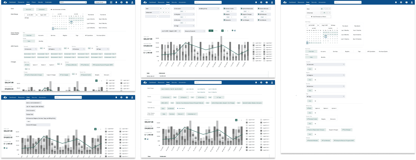
With structure settled, iterations focused on the details determining usability: chip truncation, the expand/collapse affordance, and how applied state rendered across filter combinations.
03 — Validation
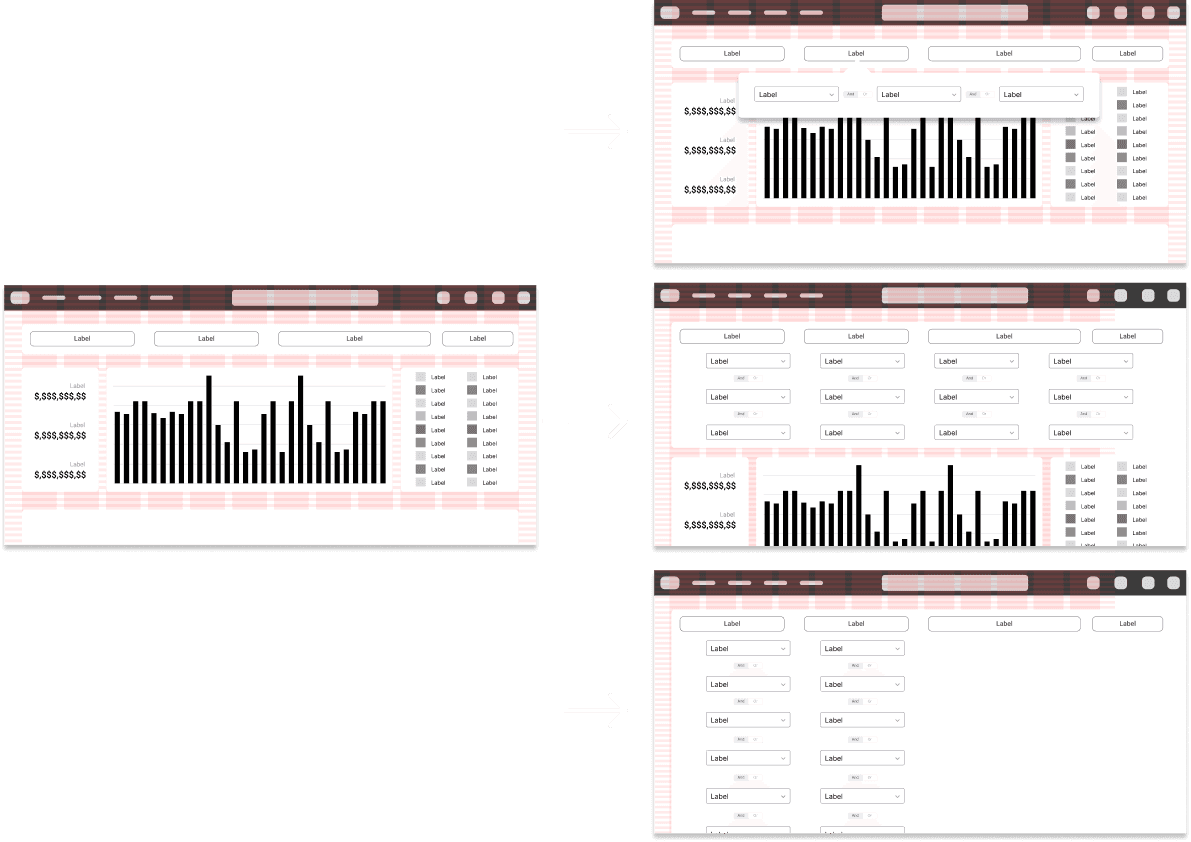
I validated filter placement directly with customers and sales engineers on Cost Reports, the most heavily filtered page. Feedback led to further simplification: all filter sections collapsed into a single line.
The System
One component. Every context.
The output wasn't just a set of redesigned pages — it was a contribution to CloudBolt's component library. Engineering builds the component once; product teams configure it through props. New pages get consistent filters without any bespoke design or engineering work.
This was the moment the project stopped being a cleanup and became an investment. Every future page in the product inherits the fix automatically.
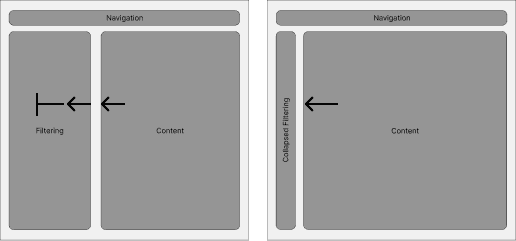
Collapsed
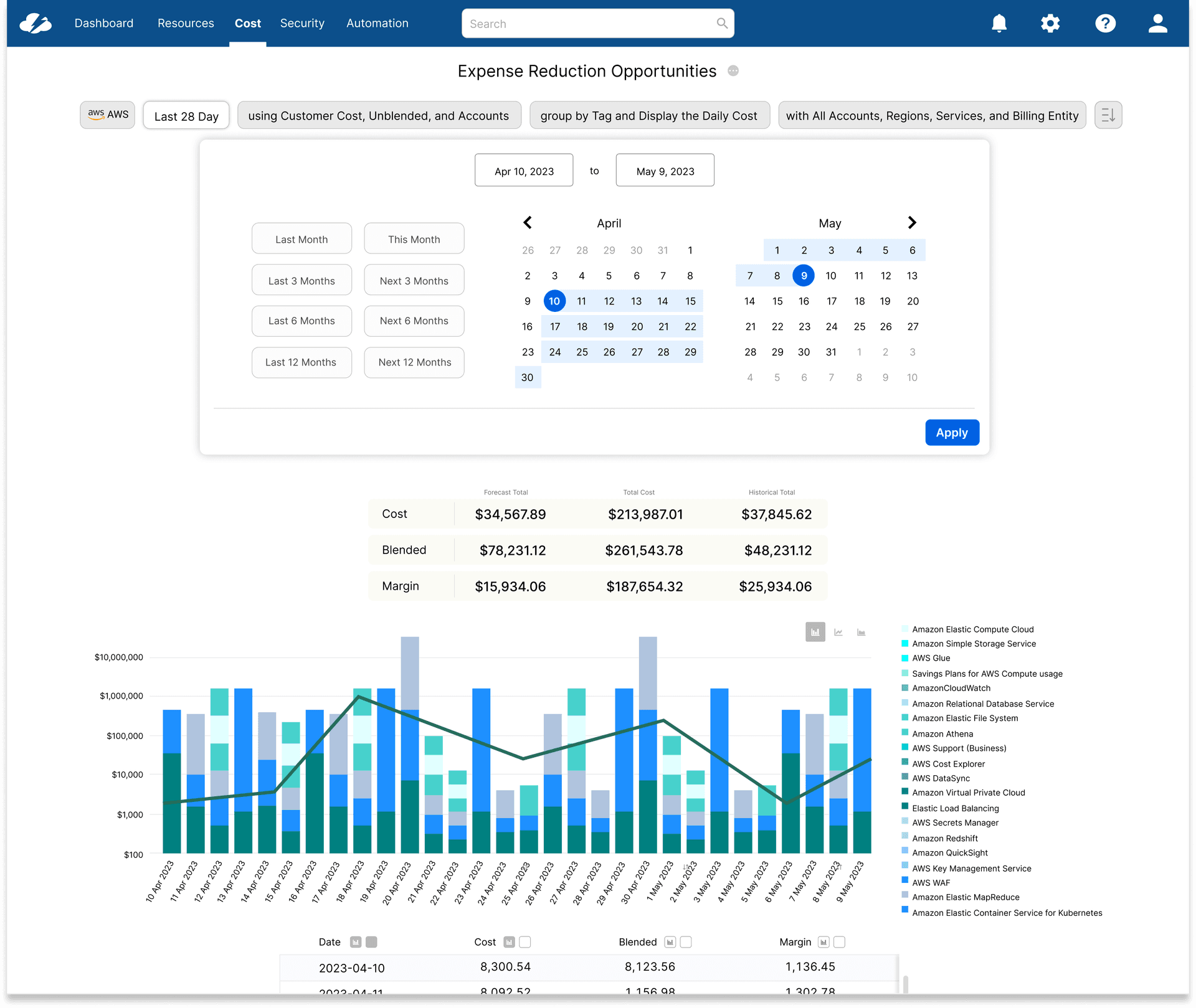
Expanded
Applied Across the Product
The same component, deployed to four pages. Each one shows the same pattern — but the impact varies depending on how far the original was from the standard.
01
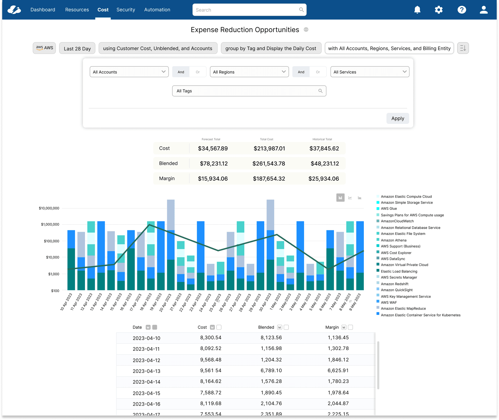
Cost Reports
The natural starting point — the most complex, heavily filtered page in the product. All filters collapsed into a single horizontal bar; analysts could see active state at a glance instead of reopening controls. Establishing the pattern here first gave every subsequent page a reference to point to.
02
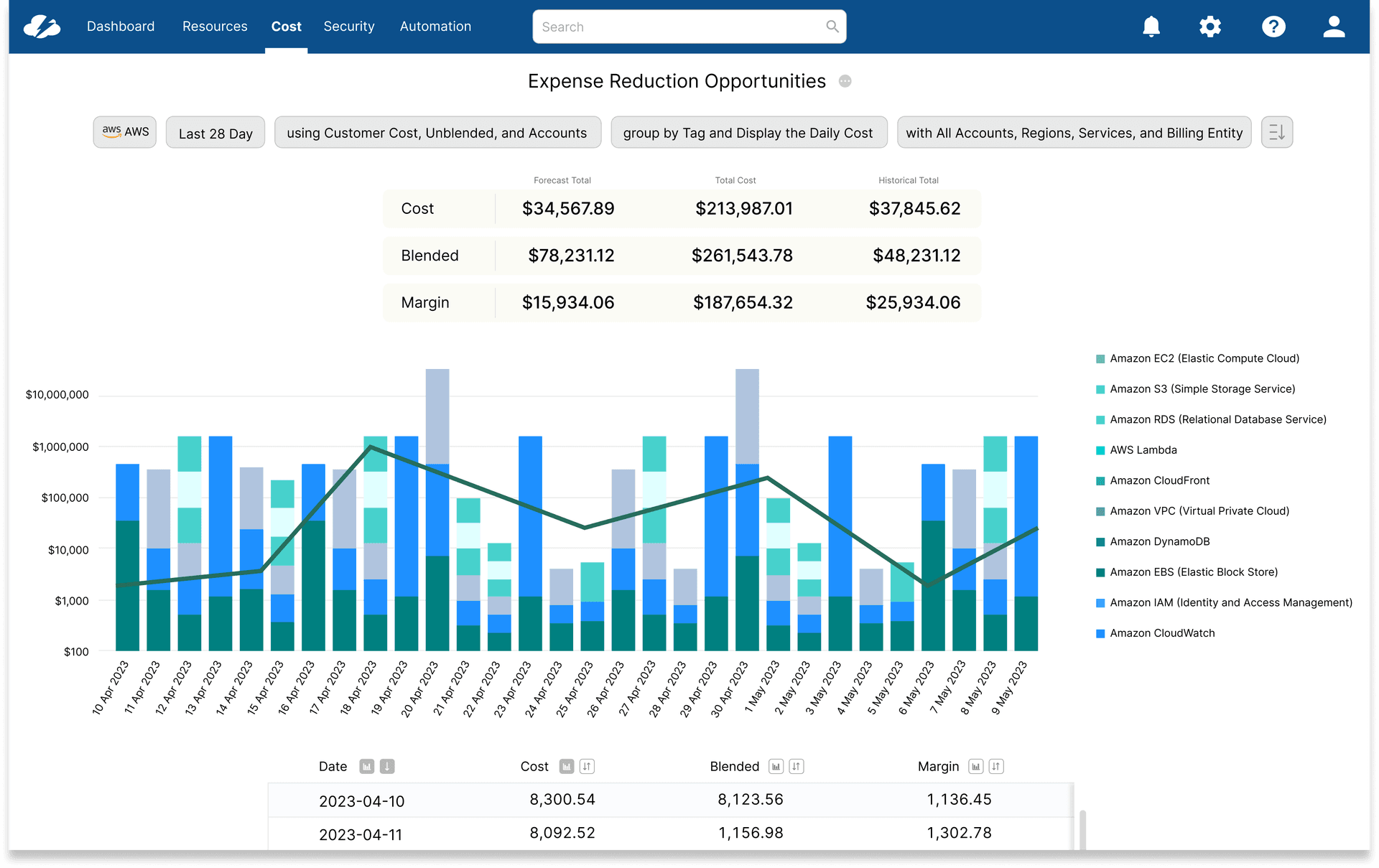
Dashboard
Dashboard content had always competed with an always-open filter stack for vertical space. The collapsible bar reclaimed it immediately, and filter state persisted across navigation for the first time — no more re-applying context after drilling in and returning.
03
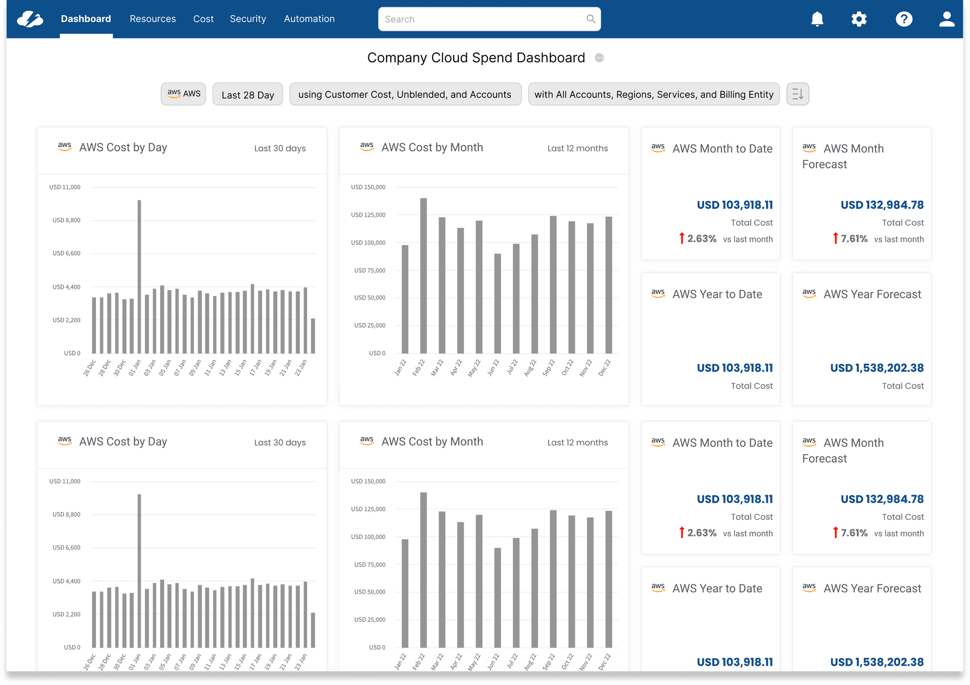
Service Adviser
The most significant engineering result: zero incremental code. The unified component's configuration handled a page that previously had its own custom filter logic entirely outside any shared system — inheriting the fix without writing it is what earned lasting engineering buy-in.
04
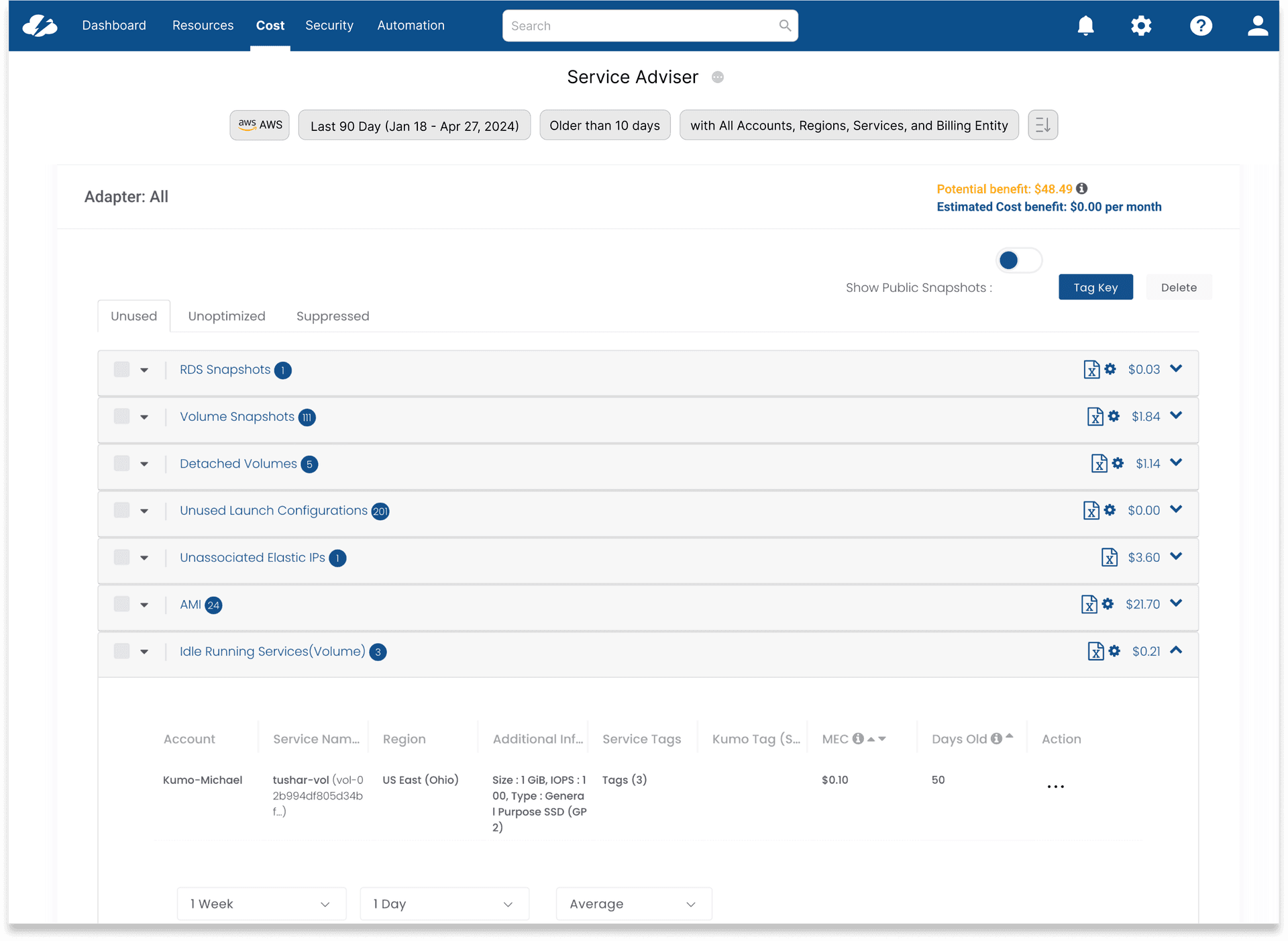
Service Manager
The page where the change was most visible — the old layout was the furthest from any recognizable pattern, with admin and user options mixed and no chip summary. Applying the unified component didn't just make it consistent, it made it usable for the first time.
"I didn't realize how much time I was spending re-applying the same filters until it stopped happening. Same controls, every page — it just works."
FinOps Analyst, enterprise customer — post-launch
Reflection
What I Learned
The hardest part of this project wasn't the design — it was change management. Four pages meant four engineering owners, each with opinions about why their implementation was right. Getting alignment required showing the data before proposing a solution, not after.
Building this as a shared component rather than four individual fixes required extra upfront coordination with engineering, but paid back immediately: when new pages needed filters, there was nothing to design. The pattern already existed.
This reinforced something I've seen repeatedly in enterprise products: inconsistency isn't usually the result of bad decisions, it's good decisions made in isolation. The fix isn't to critique the past — it's to build infrastructure that makes future isolation impossible.
Next Project
03Chat Interface
AI Research & Design Exploration