
Enterprise SaaS / FinOps
CMP Platform Redesign
CloudBolt asked for a visual refresh. What the research revealed was a product built around administrators — in a market where developers needed to be in the driver's seat. This is the story of how structured research changed the entire direction of the project.
Results
"I can't show my boss the value of the tool."
Customer interview — the insight that reframed the entire project
Challenges
The brief said "visual refresh." But the real constraints ran deeper — a product built on the wrong architecture for its actual users, with no instrumentation to prove it, and an engineering team without frontend experience to execute the change. Every design decision had to account for what was structurally possible, not just what was right.
Constraints
- —Admin-focused product architecture — rebuilding for developers meant rethinking every nav pattern, terminology choice, and default state
- —No front-end framework in place — visual and interaction improvements were blocked until the engineering foundation existed
- —Limited usage and behavioral data — Heap had to be instrumented before data could inform decisions
- —Slow release cycles — design had to account for what could ship incrementally, not just what was ideal
- —No public API surface — integration and extensibility work was entirely internal
- —No dedicated front-end engineering experience — new capabilities required hiring or upskilling in parallel with design
Objectives
- ↗Reorient the product around developer self-service
- ↗Introduce a modern front-end framework
- ↗Instrument the product to gather behavioral metrics
- ↗Build a dedicated product and design team
Research
The research ran across four tracks simultaneously — internal behavioral data, a heuristic evaluation, internal team feedback, and direct customer interviews. The convergence of what each track surfaced made the direction impossible to argue against.
Internal Data
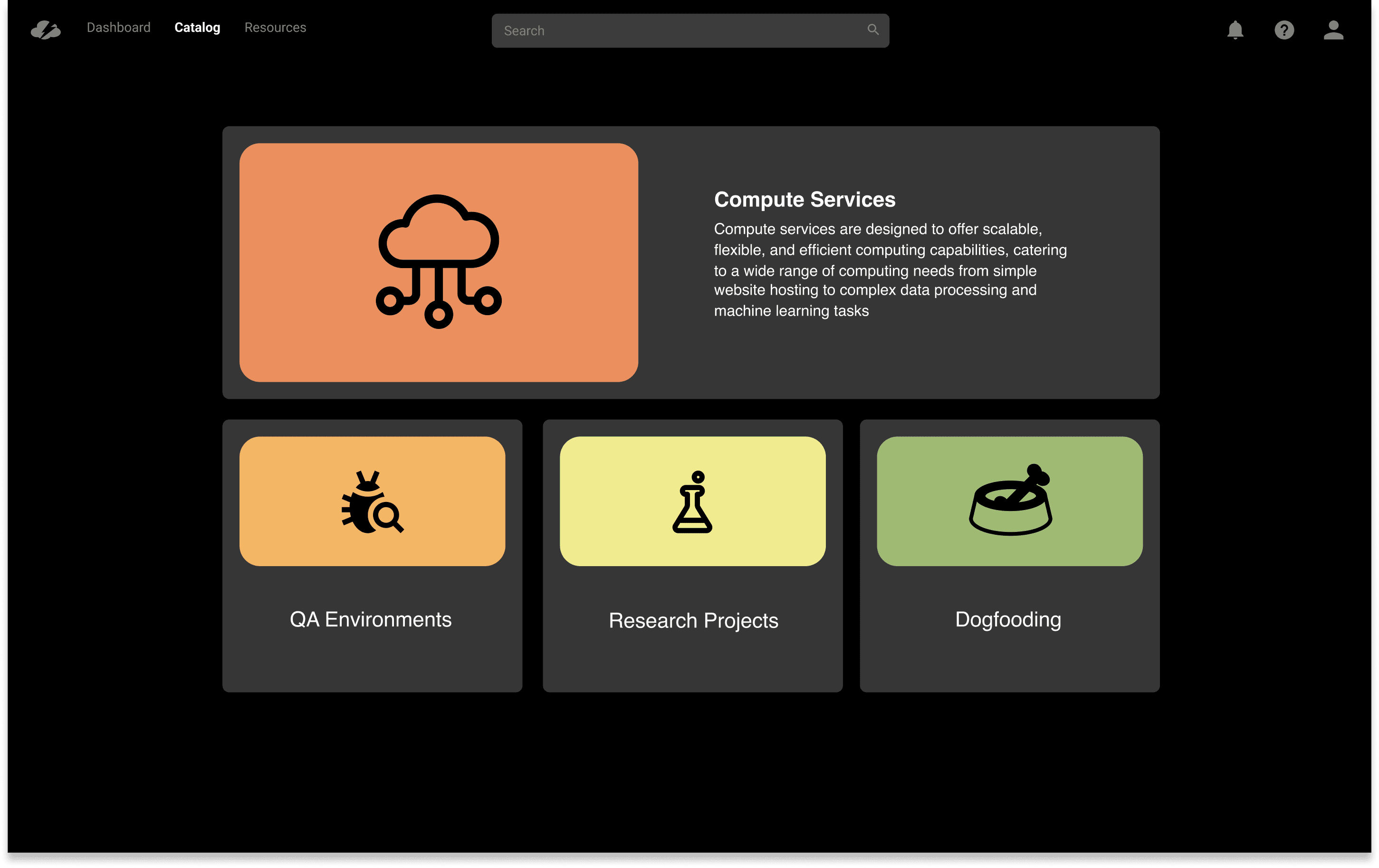
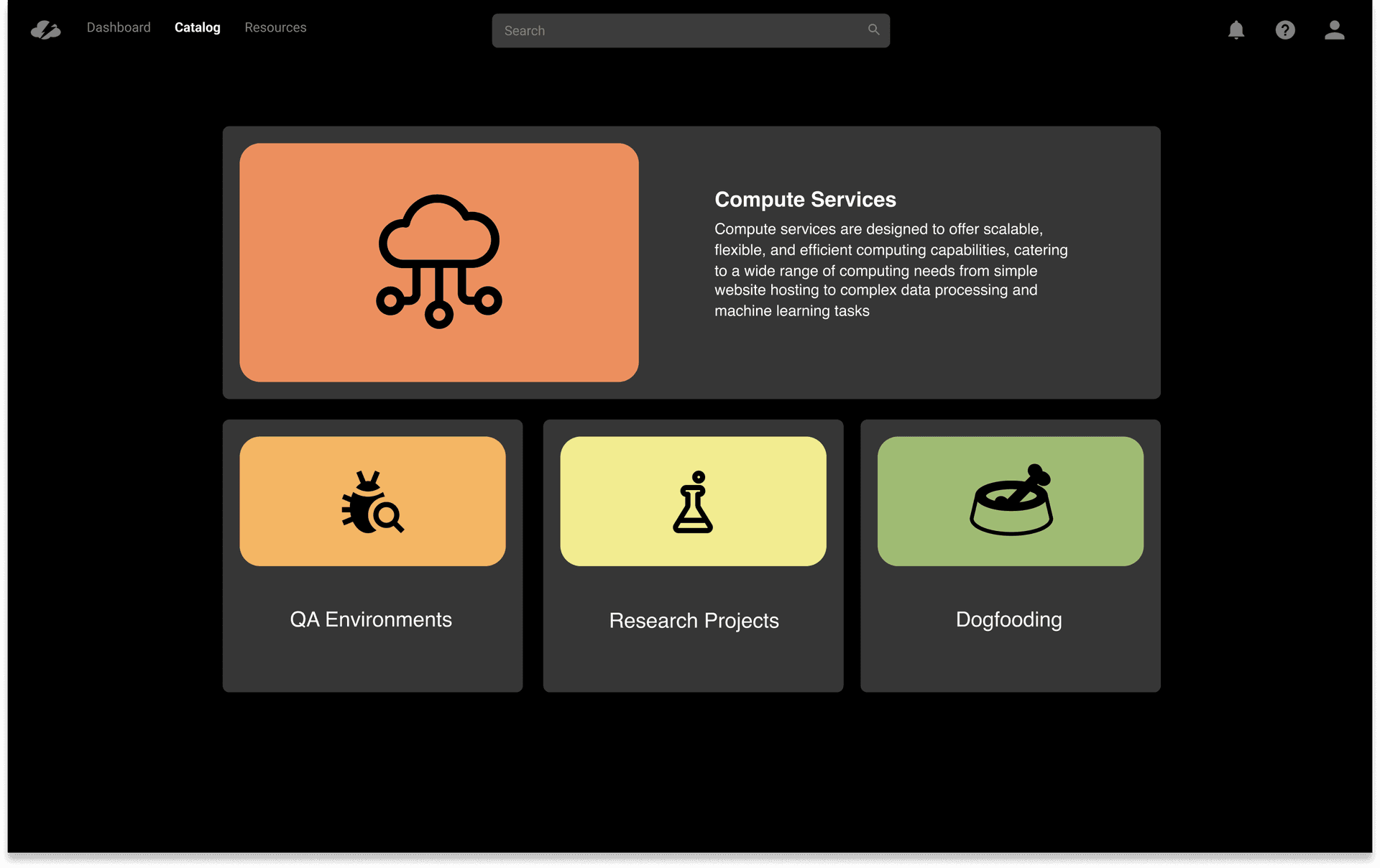
A category-based catalog entry point — restructuring the first page around service types rather than a flat list, to surface the full breadth of available services and push adoption beyond VMs.
Heuristic Evaluation
A complete reorientation from admin-first to developer-first — rebuilt navigation, rewritten product terminology, and new task flows that matched how work actually gets done.
Internal Feedback
The admin reporting layer and dashboard — the most consistently requested missing capability across every internal channel, validated before a single screen was designed.
Customer Interviews
10 customers · 4 weeks
Three distinct decisions: the reorder feature, the admin dashboard, and the self-service catalog structure — each traced to a specific interview finding below.
Behavioral Data
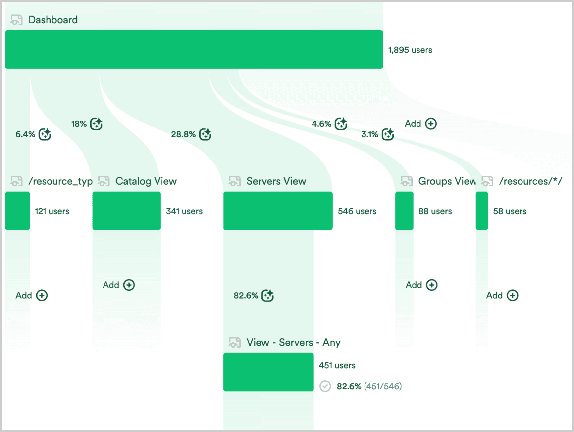
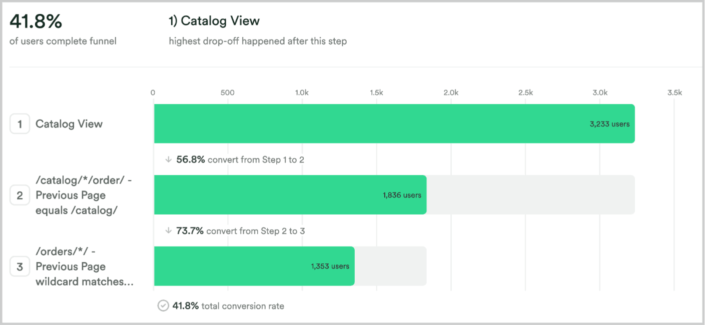
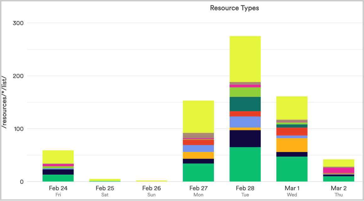
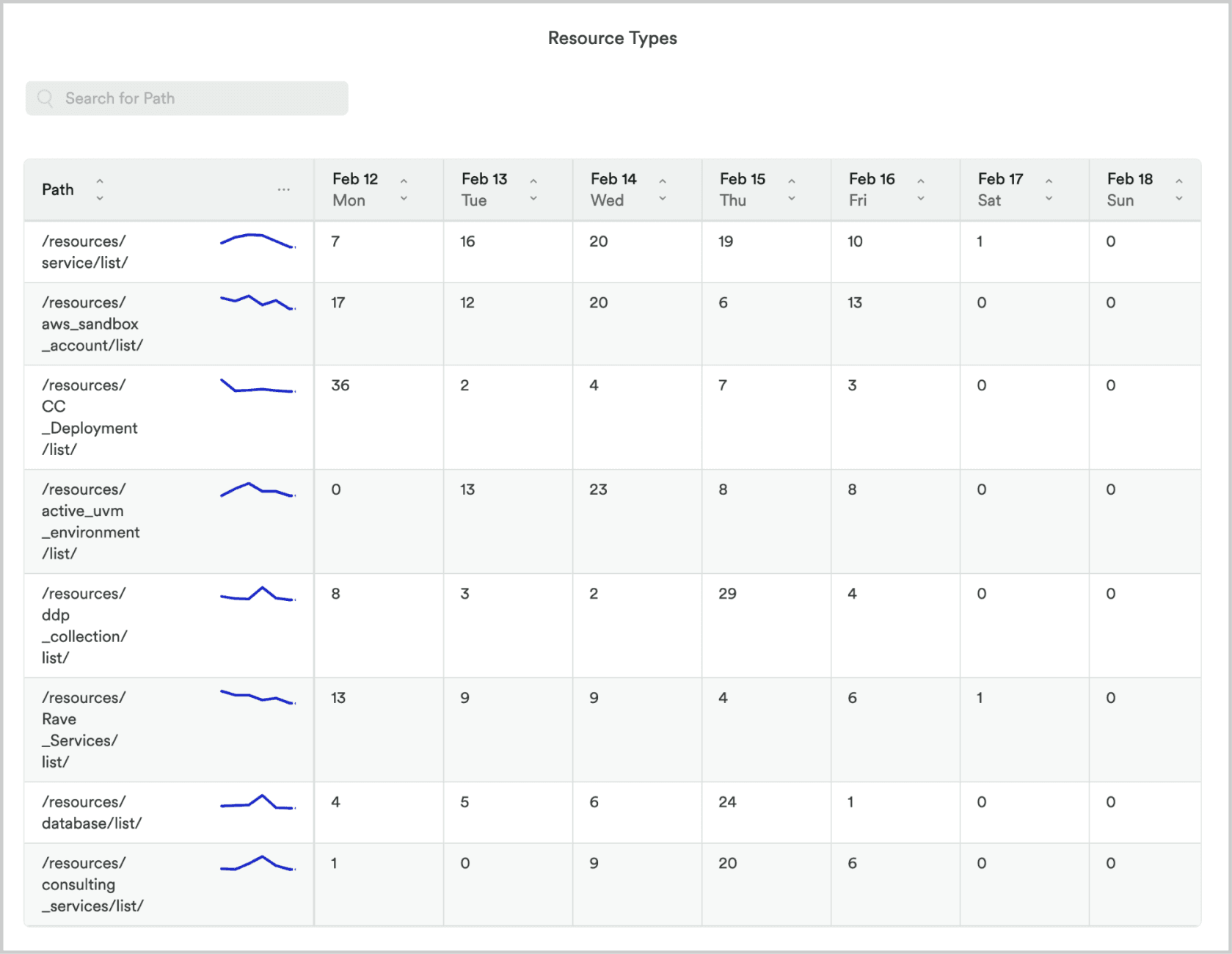
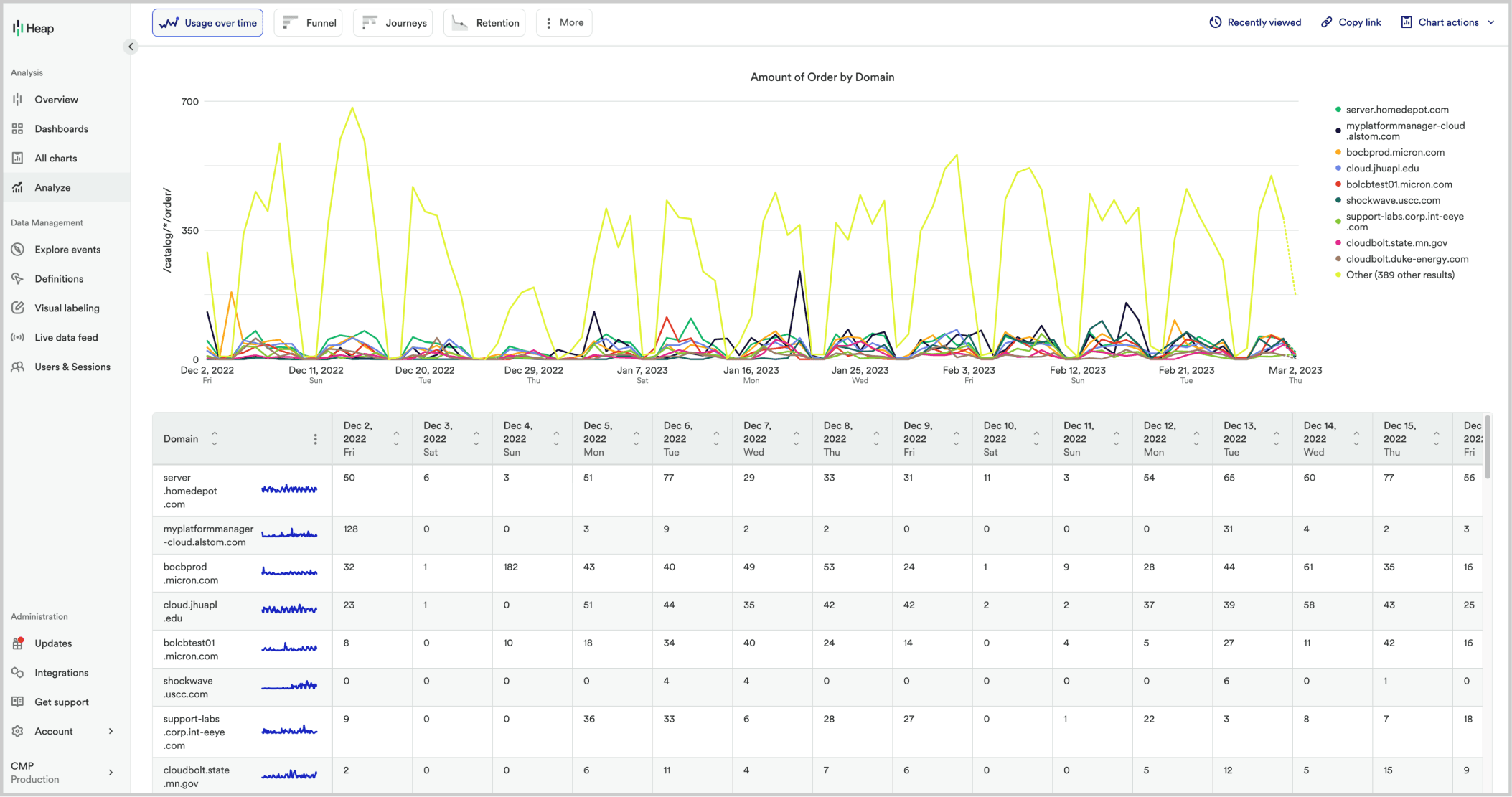
Before any design decisions were made, we instrumented the product with Heap to map actual user behavior. Two findings shaped the redesign most directly. The ordering funnel sat at 41.8% completion before the redesign — improving to ~68% post-launch.
Competitive Review
Developer tooling had moved on while CMP stood still. A review of leading platforms surfaced four patterns that were reshaping how developers expected to navigate and discover services — each one fed directly into a specific design decision below.
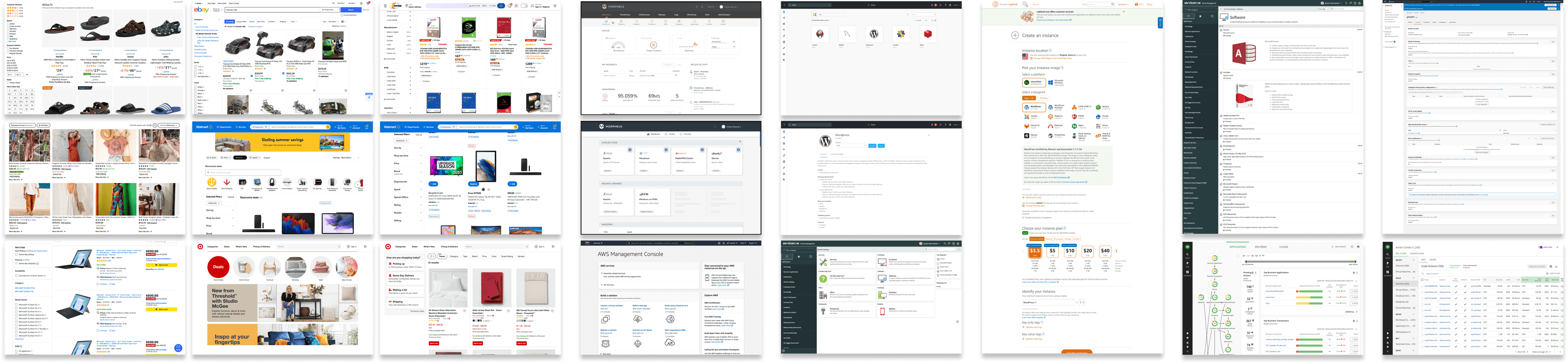
- High-quality product imagery → the Blueprint View card grid
- Modern, collapsible filter design → the later unified filter bar project
- Prominent search → fast-path ordering for power users
- Category-based browsing → the Category View entry point
Users
CMP served three fundamentally different audiences — developers, admins, and team leads — and the original product had only designed for one of them. The redesign had to serve all three without compromising any.

Developer
Category View · Blueprint View · Reorder

Admin / IT Manager
Admin Dashboard · Resource Management

Team Lead
Category View · Blueprint View
Core Developer Flow

Mapping the developer's path from login to ordered resource revealed how many unnecessary steps existed. Eliminating them drove every subsequent layout and navigation decision.
Design Process
Getting to the right solution required going back to fundamentals before touching Figma — sketching the information architecture, then stress-testing it against the grid before committing to visual execution.
01 — Sketching
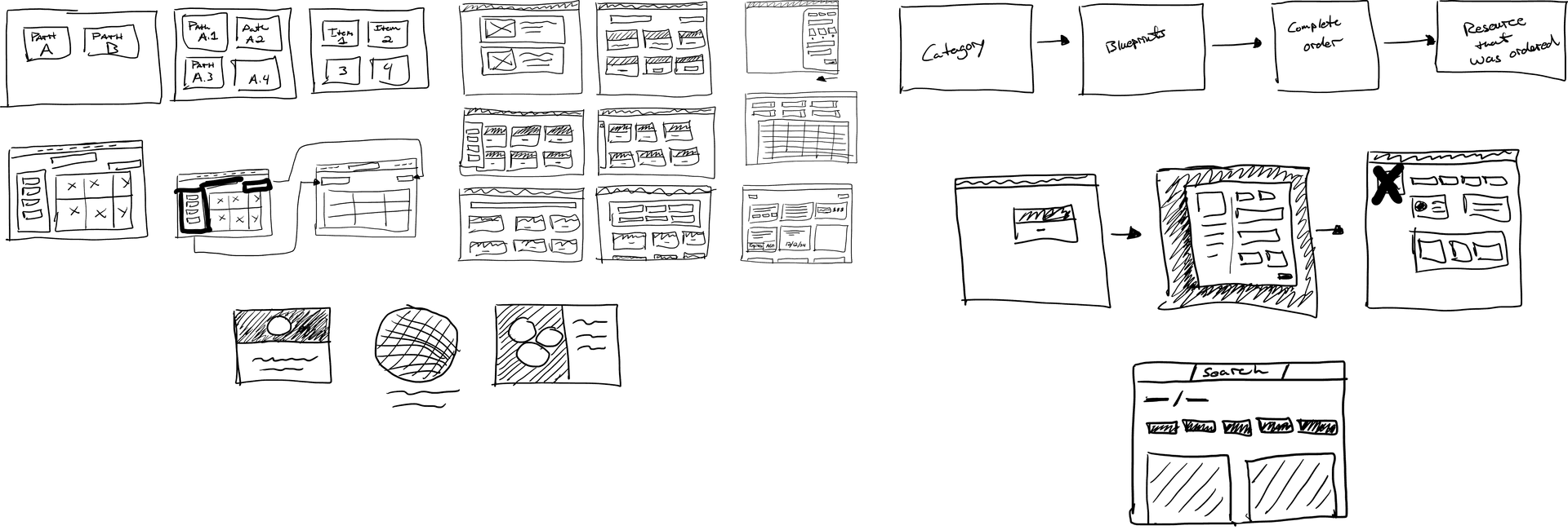
Early sketches explored the category hierarchy, the relationship between browsing and search, and how the ordering flow should connect to resource management — before any visual decisions were made.
02 — Wireframing
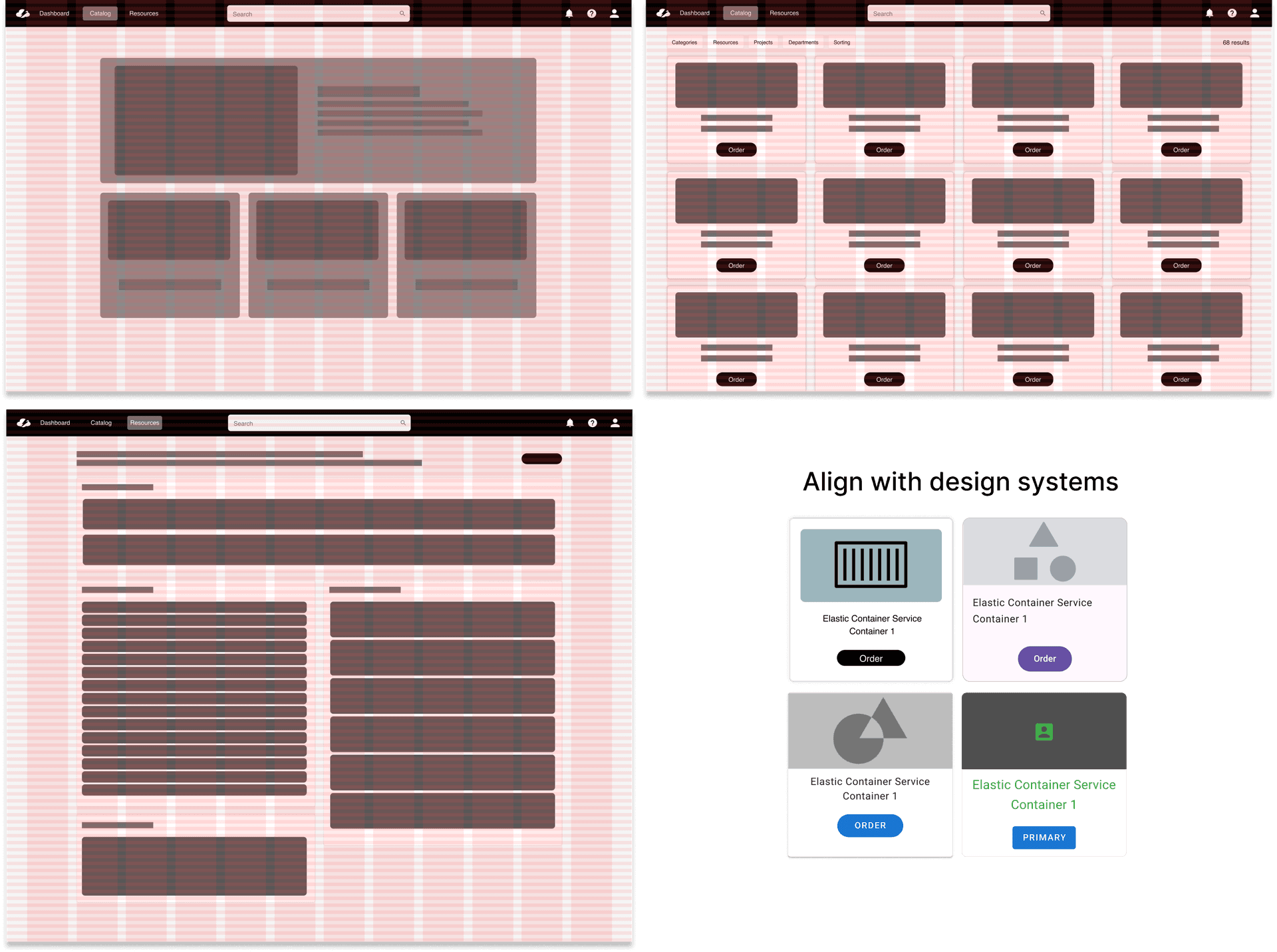
Mid-fidelity wireframes validated the layout against the grid and tested different densities — ensuring the design held up across catalog sizes and screen widths before moving to high-fidelity.
Final Designs
Five core areas of the product were redesigned. Each decision was grounded in something we heard directly from users — not a designer preference.
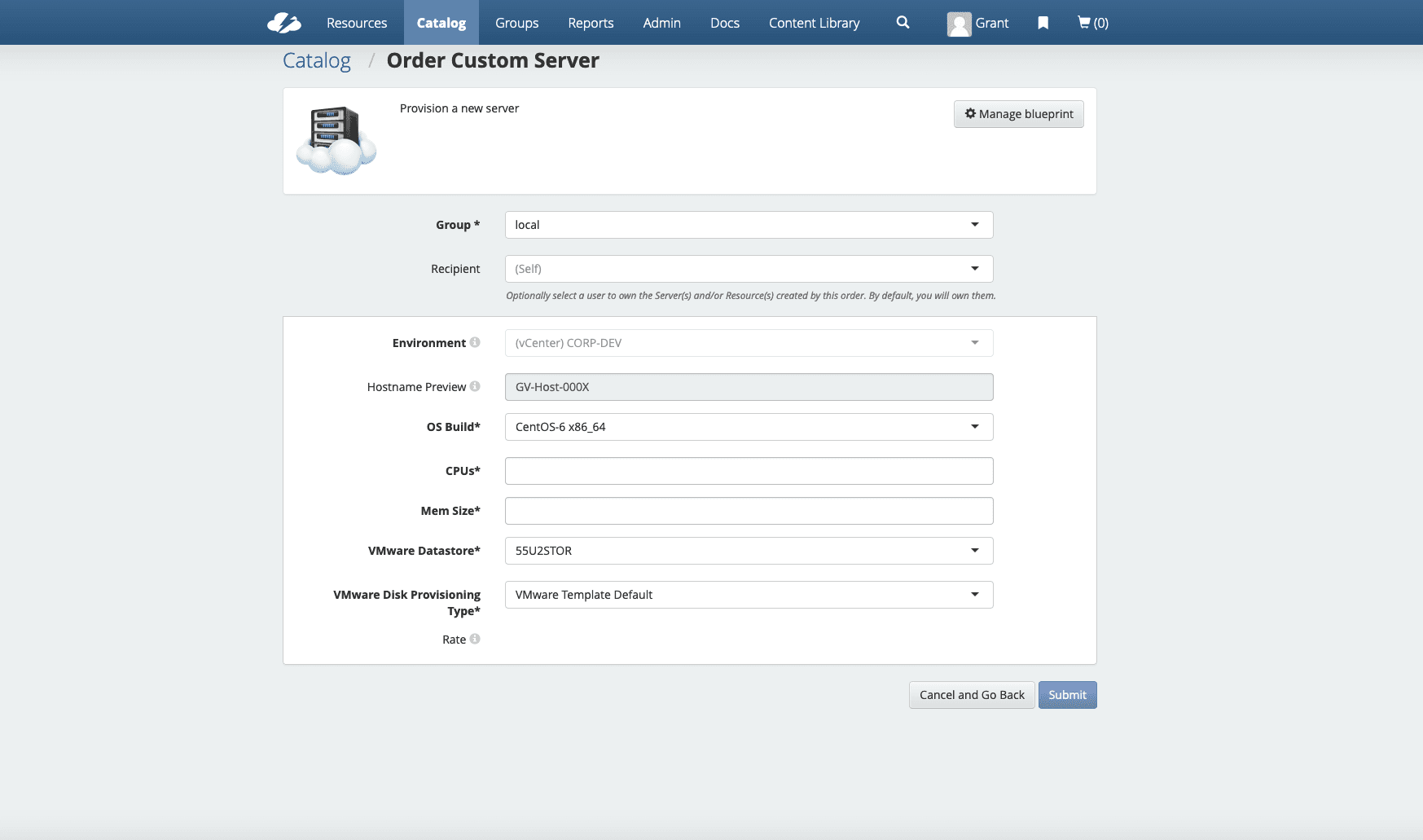
Before
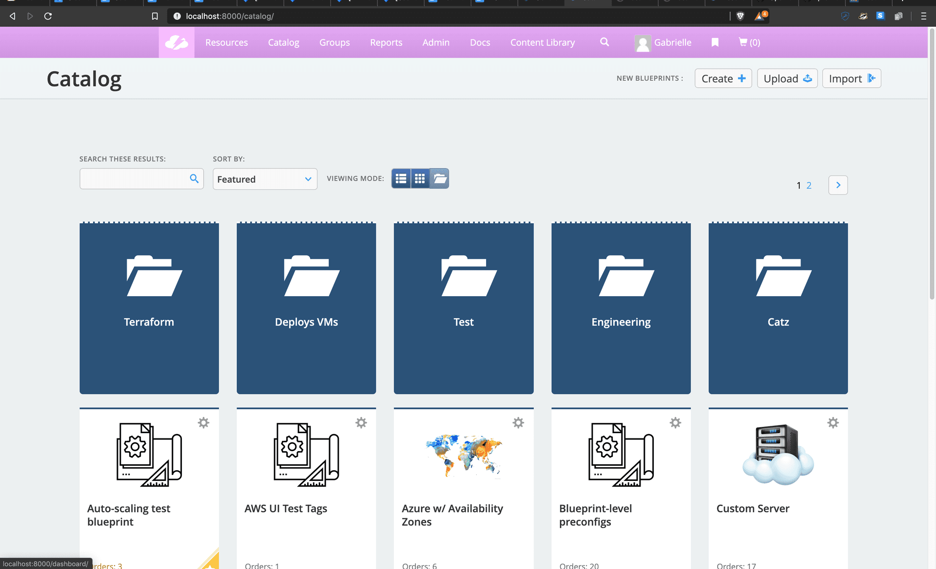
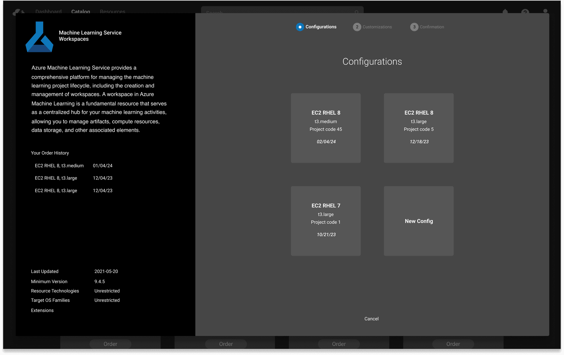
After
02
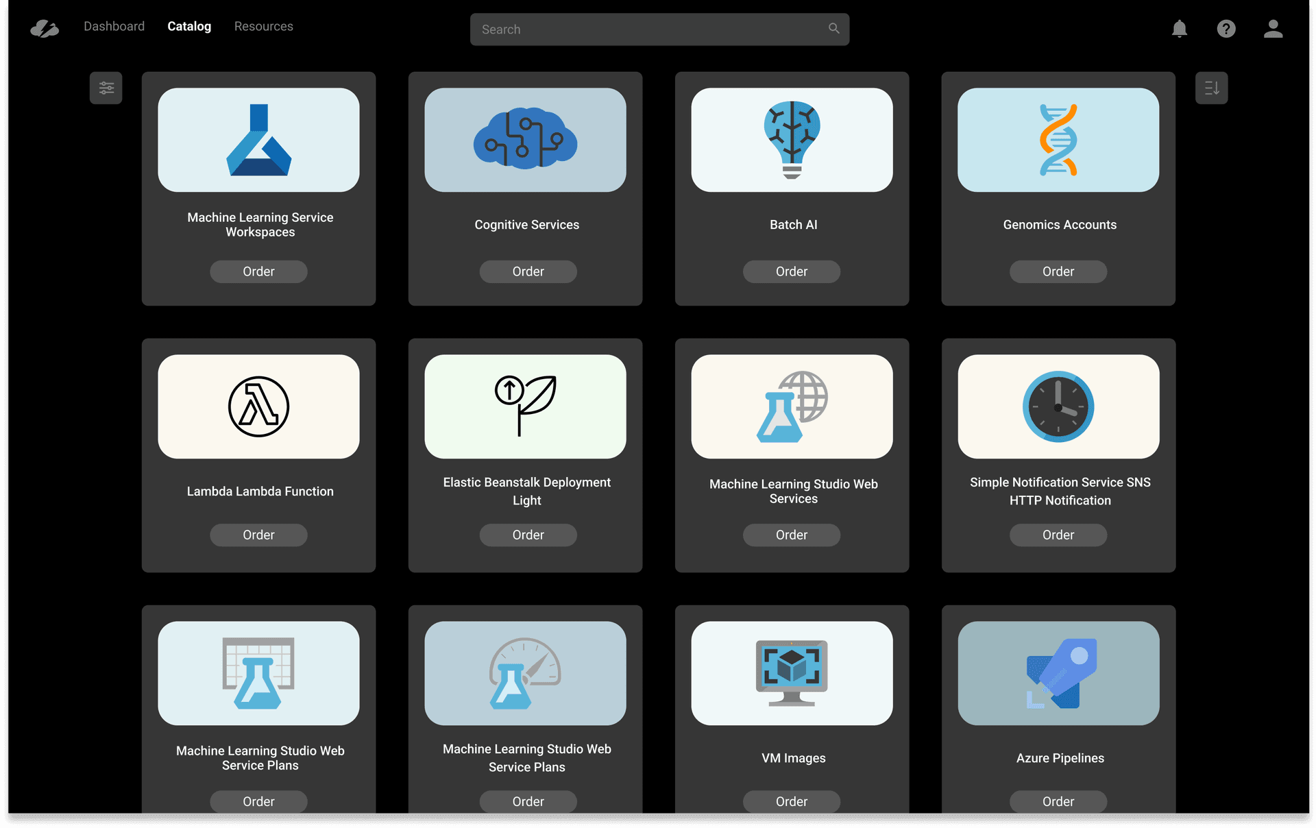
Blueprint View
The service listing was rebuilt around a card grid with high-quality service icons. Filters were collapsed into a single unified control. Admin reporting was removed from the primary view entirely — it had no place in a developer-focused workflow. The result was a catalog that felt like a tool developers wanted to open, not one they were required to use.
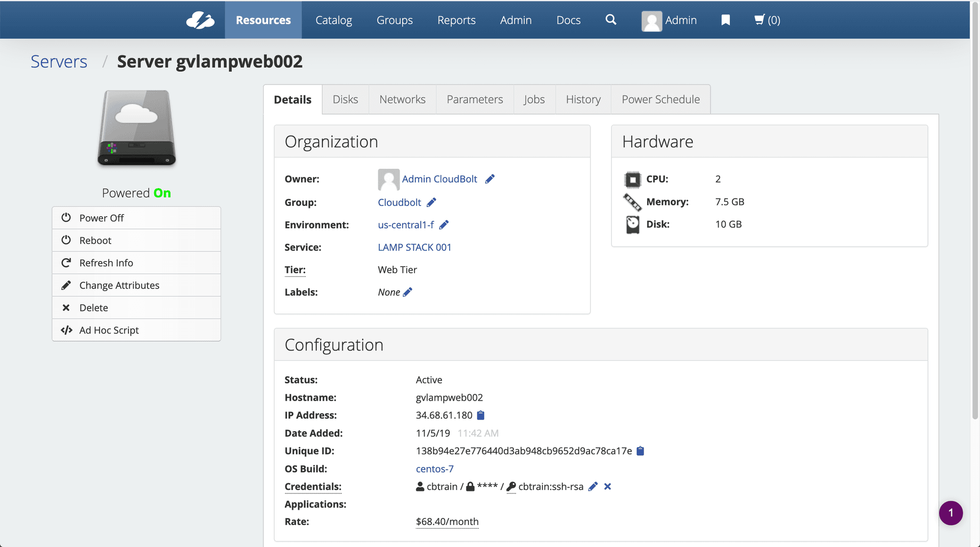
Before
After
Before
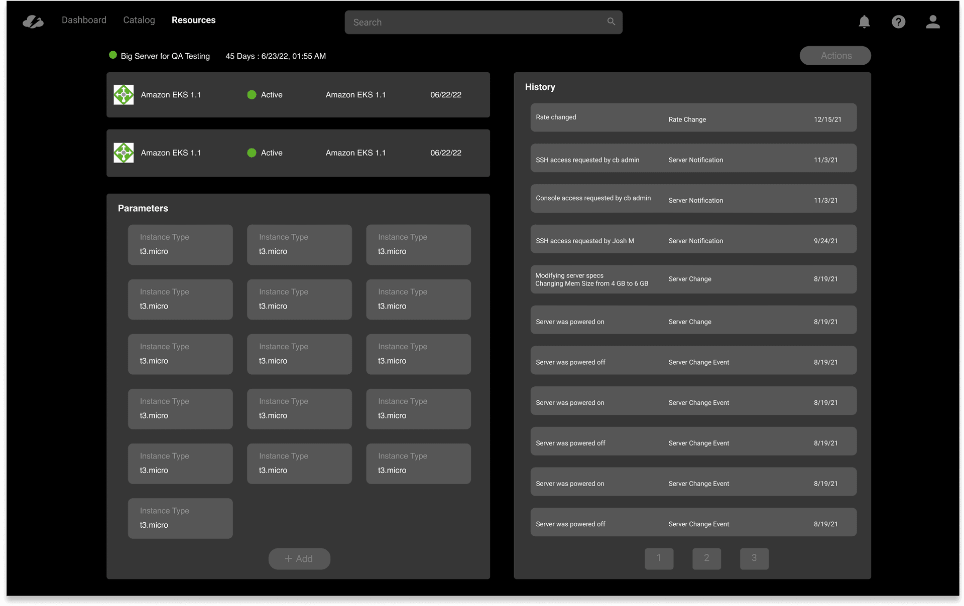
After
05
Admin Dashboard
One of the clearest gaps from customer interviews: admins had no visibility into how their platform was being used. The new dashboard gave them a live view of spending, service popularity, order volume, error rates, and customer traffic by cloud provider. It turned CMP from a tool users complained about into one they could defend — and promote — to their leadership.
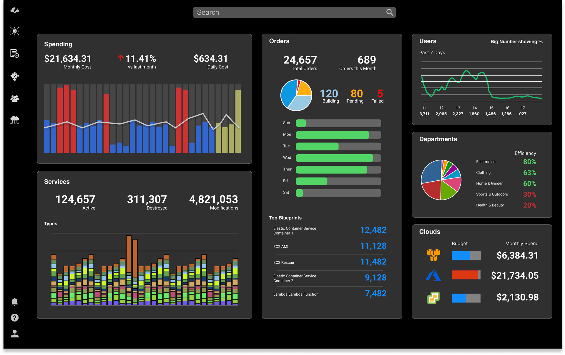
"Before this, I had no way to show my leadership what the platform was actually being used for. The new dashboard changed that conversation entirely."
IT Administrator, enterprise customer — post-launch
Reflection
What I Learned
The most important decision on this project was made before any design work started: insisting on research before opening Figma. The original brief was a visual update. The research reframed the problem as a product strategy problem — and that reframe was responsible for the outcomes.
Holding design, product, and research responsibilities simultaneously created real pressure — speed and coherence, but also the temptation to rationalize shortcuts when you control the whole process. I built in deliberate friction: writing down tradeoffs explicitly, sharing early work with people likely to disagree, and resisting the move to high-fidelity before structural decisions were genuinely settled.
The reorder feature was the clearest example of research paying off in ways nobody predicted from the original brief — it came from a single interview insight and became one of the most-used features in the redesigned product.
Next Project
02Filter Consistency
Design Systems & Interaction